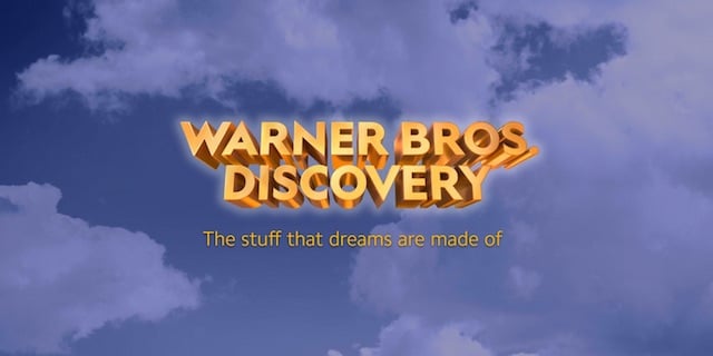
Recently, Warner Bros (the makers of the Harry Potter films and The Conjuring films) and Discovery have recently merged together. The two studios have released their new logo, but it has not gone down as well as they had hoped.
Unfortunately, fans were less than impressed with the new logo, which many said was not only basic but reminded them of WordArt. Definitely not the impression Warner Bros Discovery was aiming for.
This current logo is pretty different from what we are used to seeing from Warner Bros, as the iconic shield logo has been removed. However, this new logo definitely does not look as though as much effort went into it compared to the company’s instantly recognizable shield logo. And fans have clearly noticed!
However, there is some good news for those of us who think this logo was a bit of a letdown. It is actually just an ‘initial wordmark’ rather than a confirmed finished logo. So, hopefully, Warner Bros discovery takes on the internet’s feedback and make some changes to their logo.
If you enjoyed reading this article, then you should check out our article on how a violent death scene was cut out of Warner Bro’s The Dark Knight Rises.