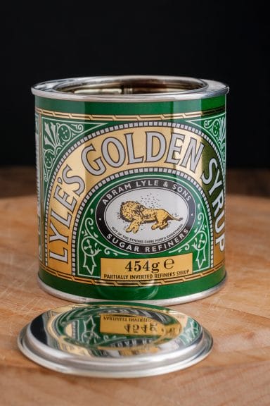
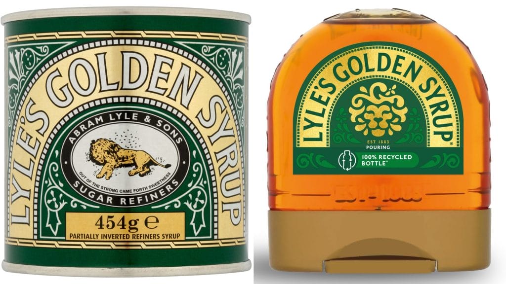
If you open a cupboard in a kitchen in Britain, you’re likely to spot a few things. Teabags, biscuits, sugar. And if you go to the back of the cupboard, you’ll probably spot a green and gold tin with a lion on it. It’s Lyle’s Golden Syrup – and for the first time since it was created, the logo on the tin is changing.
Since 1881, the iconic item has featured a lion’s carcass being circled by bees and was chosen by the company’s founder, Scotsman Abram Lyle. Lyle took inspiration from a biblical story from the Old Testament, where Samson slays a lion with his bare hands and later finds honeybees inside the body. Samson tries the honey, feeds some to his parents, and creates a riddle out of his experience.
The Book of Judges reads ‘Out of the eater came something to eat, out of the strong came something sweet.’ This riddle is also referred to as the phrase ‘out of the strong came forth sweetness’, and this is what Lyle chose to feature on the tin.
The image of the lion and its accompanying phrase have been on the tin for over 140 years, which was recognised by Guinness World Records in 2006. The record notes the only time the product has been altered since 1885 was during the war and was ‘due to shortages of materials.’

This isn’t the first time the company has done something different though, as they changed the colour of the tin to gold in 2008 to mark their 125th anniversary. They also released a limited-edition silver tin to celebrate the Platinum Jubilee back in 2022.
The new logo will appear on bottled products and dessert toppings by the company, but the original logo will remain on the tinned version.

Why is it changing after all these years?
Explaining the change, the company’s brand director James Whiteley said ‘consumers need to see brands moving with the times and meeting their current need. Our fresh, contemporary design brings Lyle’s into the modern day, appealing to the everyday British household while still feeling nostalgic and authentically Lyle’s.’
There have been mixed reactions on social media, with some criticising the rebrand for watering down the branding’s religious connection. But many people are more focused on discovering that the lion on the iconic packaging is dead, a detail most people had never noticed.
The decision to rebrand has been slammed by the Church of England, which said, ‘There is nothing modern about ditching tradition or sidelining Christian messaging’ and criticised Lyle’s for eradicating ‘their connection with their Christian founder’s iconic logo’ whilst ‘benefiting from sales and Christian branding every Easter’. Tate & Lyle responded with a statement to The Telegraph.
‘Religion played absolutely no part in our decision to try something different on our syrup bottles – a product format where we regularly use different approaches to our brands,’ and ‘It makes me sad that we might have unwittingly upset people today, and I want to apologise for that.’
Tate & Lyle Sugars
To discover the meaning behind another famous logo, check out this article about Beats by Dre.


